
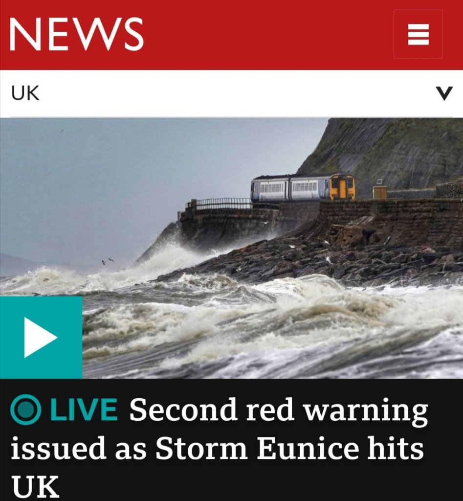
Colour is forcing itself to be a returning theme this week. Storm Eunice is whipping up a storm as I write. Eunice is said to be the worst Storm in more than 30 years. And has, unusually for the UK been given a red warning status. The last time I experienced a storm of this magnitude I was living in Brighton. As it happens, serendipitously, yesterday, I was painting some more colour cards for some of the places I have worked. Last weekends homework on the colour course I am doing. Hastily, I might add before this weekends homework arrives in my inbox.

I put three places together yesterday as they share some colours.
Brighton, Marylebone and the City of London.

It would be all too easy to depict Brighton with the colours of the rainbow. It is one of the beating hearts of the British lgbqt+community.
Like a lot of places, Brighton, when you live there, feels many different things not just the one bold stereotype. At the outset it might seem strange that these three places are linked in my mind by their colour memory palate. They are all places where I worked for a long time and although work can dominate everyone’s thinking at times. The antidote to work is what we seek to refresh our minds and spirits to enable us to do the best job possible.
All three of these colour cards have a nod to my working life by having the predominant colour of my working clothes, scrubs. After that despite being strikingly different in real life, the colour palates are remarkably similar because I always seek the same sort of things to provide mental recovery. I love architecture, parks and walking when I need to clear my head. For me these colour charts are an instant return to a time and place. The only major difference is that Brighton has the sea while the other two are deeply urban, most importantly they are all a happy place.
Time now to enter Eunice and walk the dogs…

