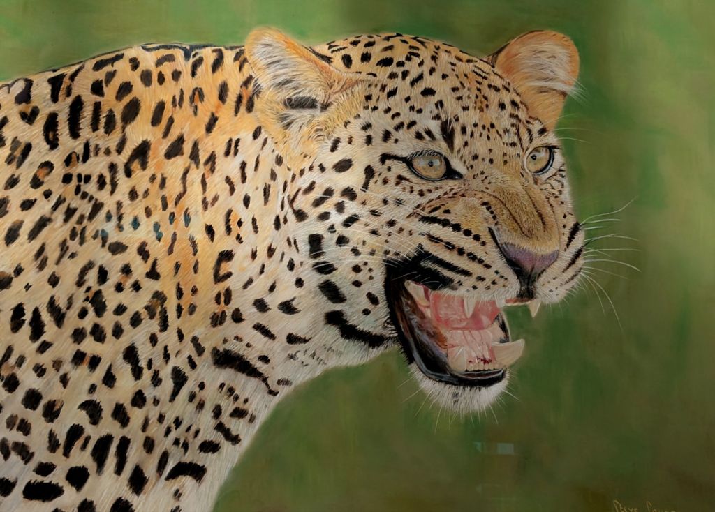
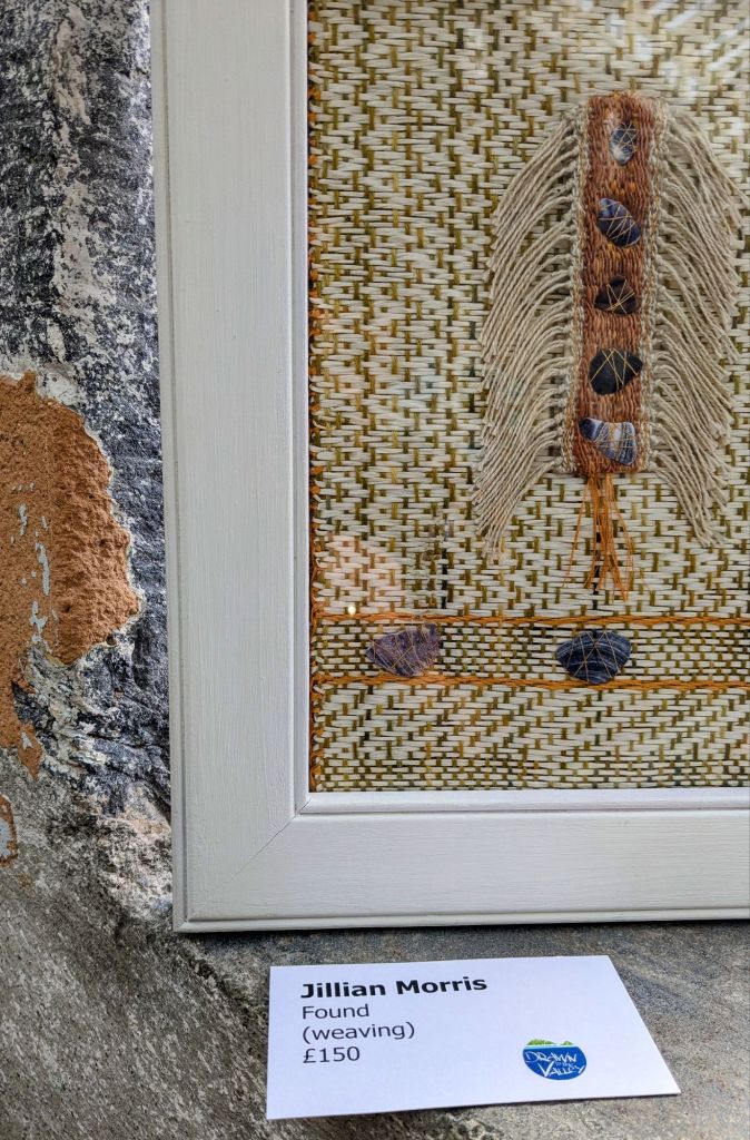
Chasing neutrals and texture, starting with a controversial one. Fashion declares that leopard print is a new neutral, so here we are with Steve Savage’s beautiful Leopard. Instinct. Below is a different type of camouflage. The perfect location for Jillian Morris’s delicate woven piece. The walls and windowsill are a perfect spot for her weave.
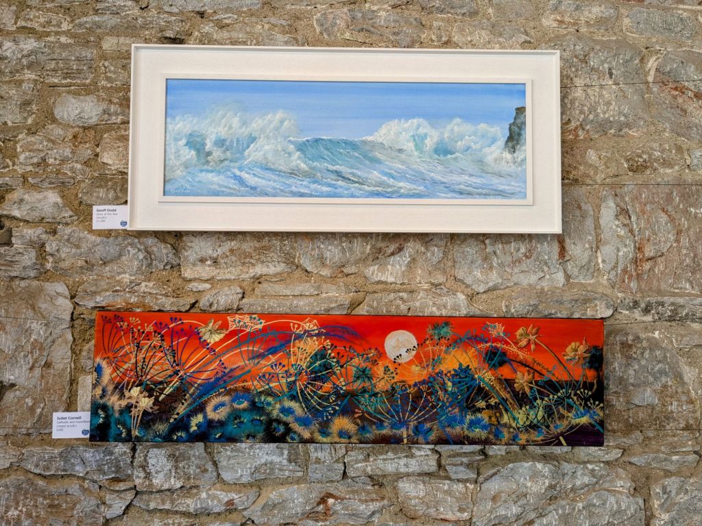
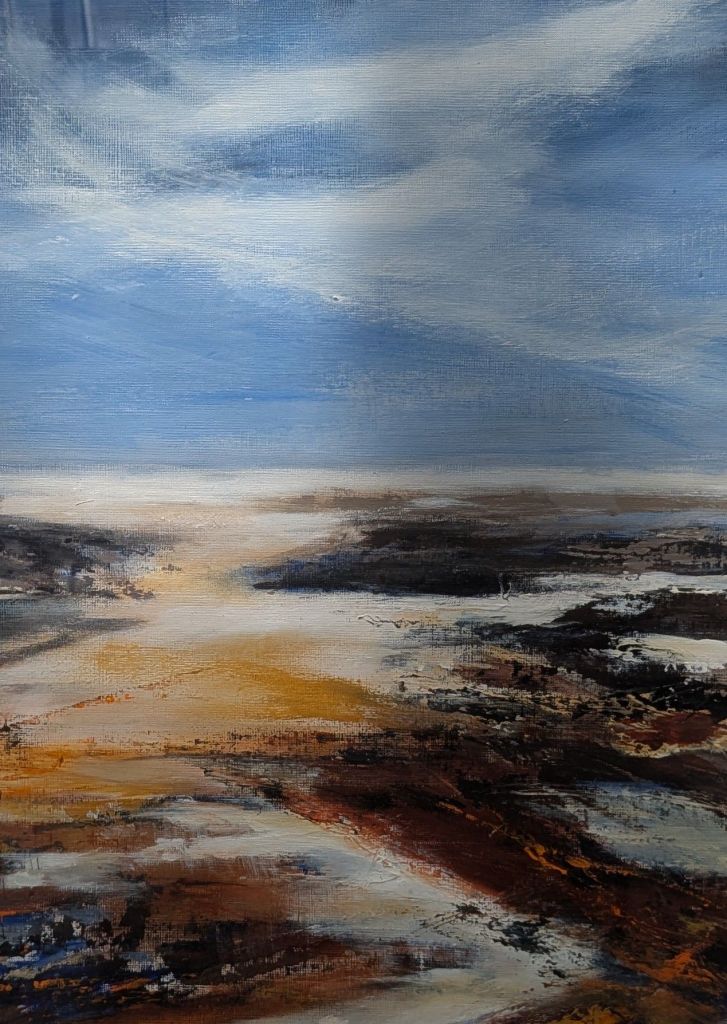
Similarly Nuala Taylor used the same neutrals for her seascape.
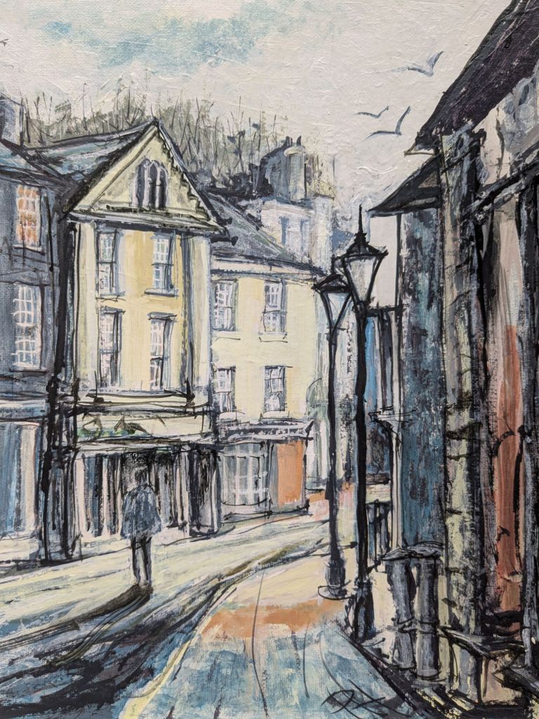
And Pippa Howes using the same neutral hues with Spring Light.
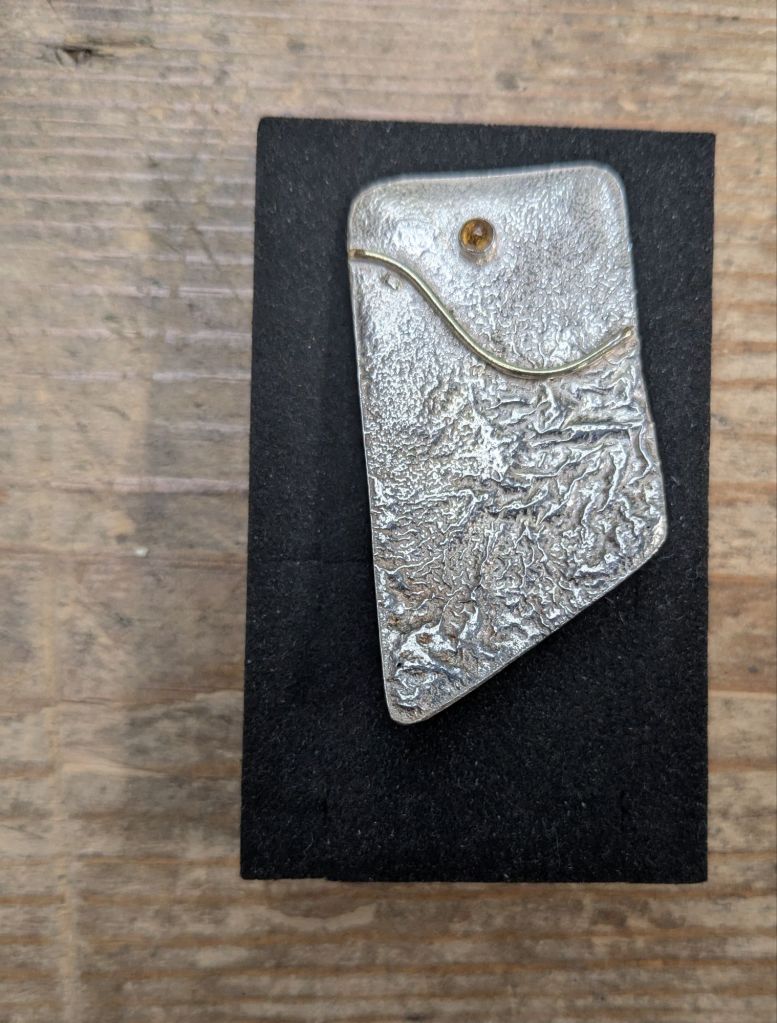
The subtle orange of Spring Light is reflected in Anne Payne’s Citrine set in Silver.
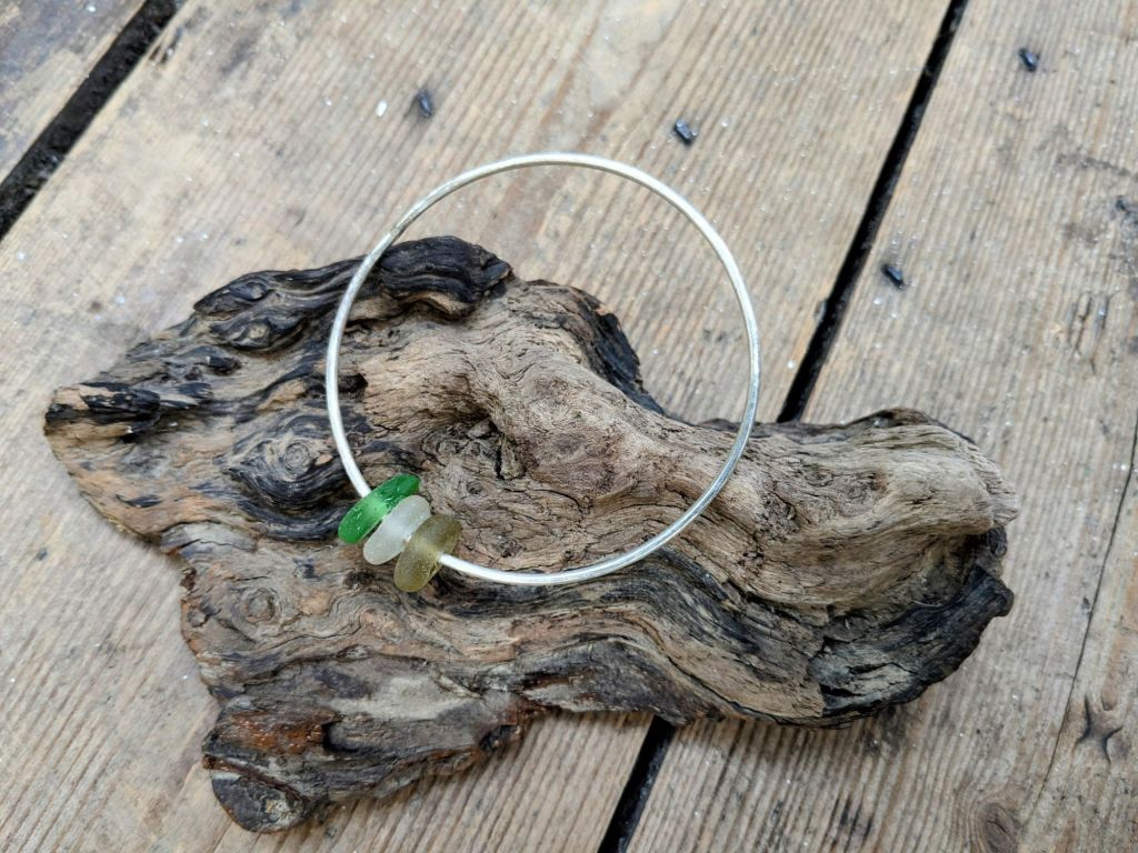
Silver merged with sea glass is the inspiration behind Kathy Lovell’s bracelet.
Leaping effortlessly from Silver to gold. Perfect beads of gold on Alison Freshnay’s Cradled leaf.

Tiny blobs of gold take us to bold ceramic blobs on Judy Haringtons tactile Yin and Yang.
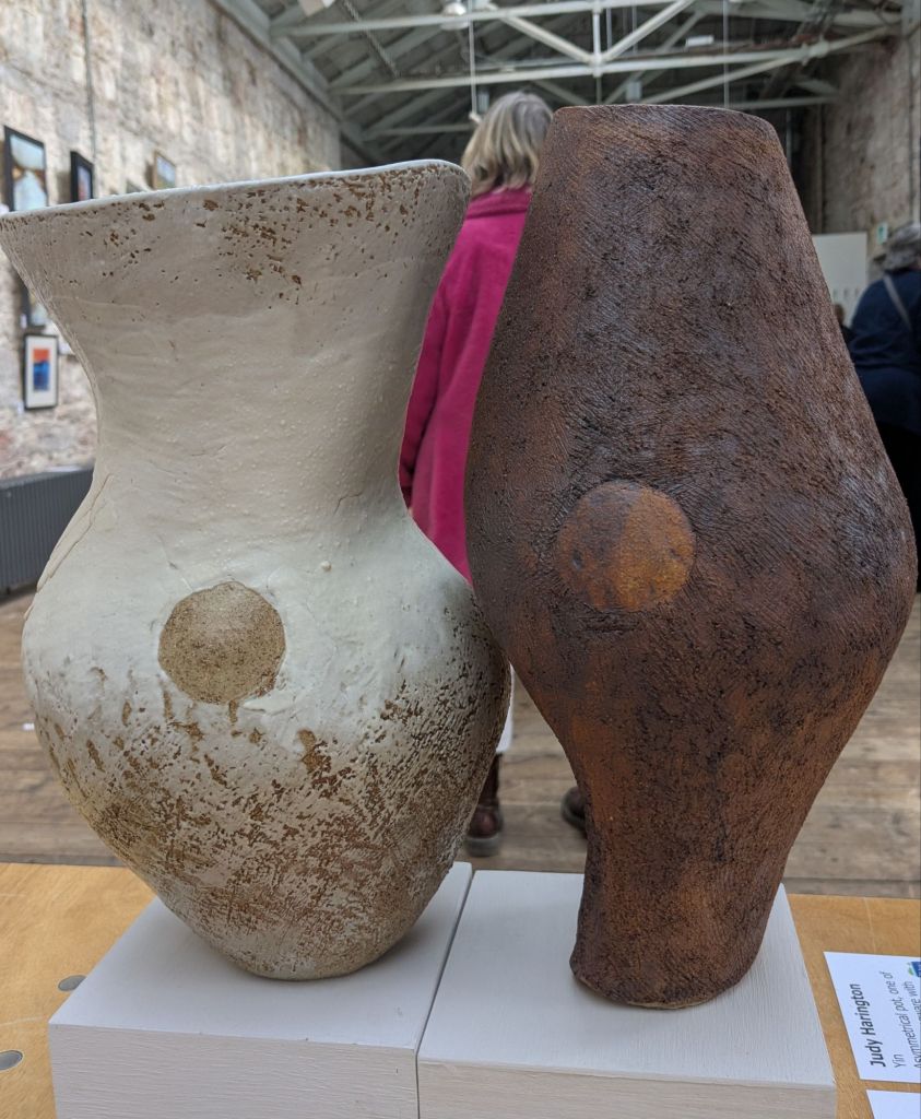
Never underestimate the value of a bold, pink coated, art lover when viewing neutrals.
Then a small black blob is the link to Celia Over’s peaceful print. Moorland Texture

One last neutral. A detail from a Gill Manning Cox work. Full image later in the week.

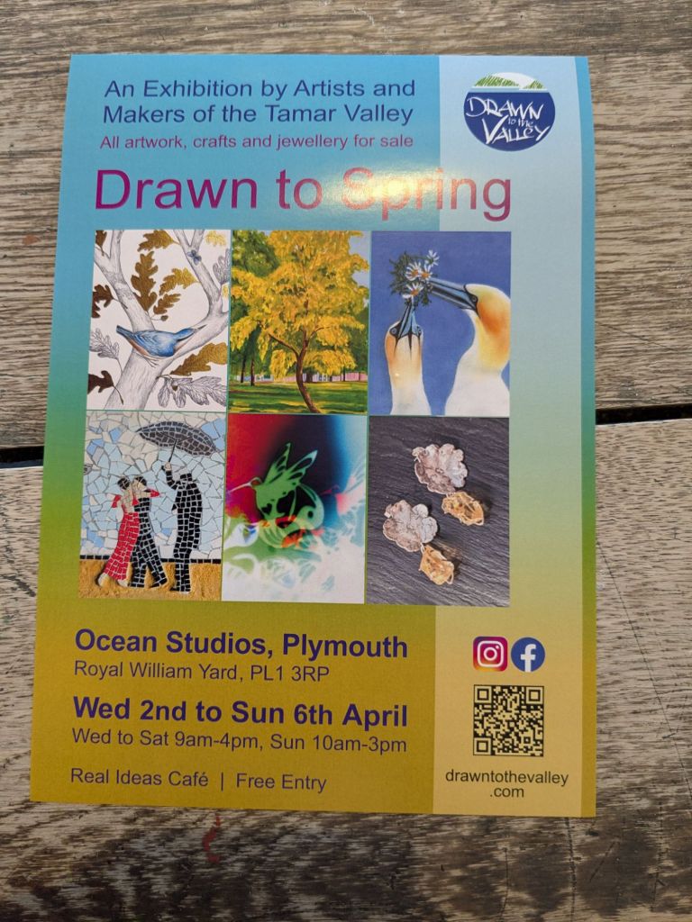
The Plymouth Breakwater. Visible from the Royal William Yard the location of the Exhibition.
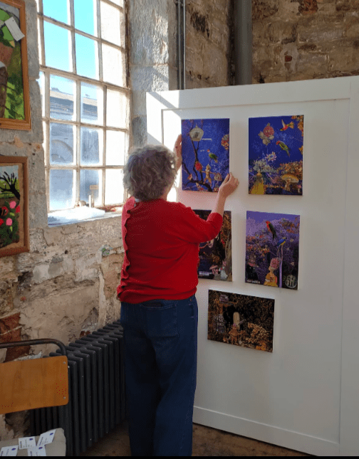
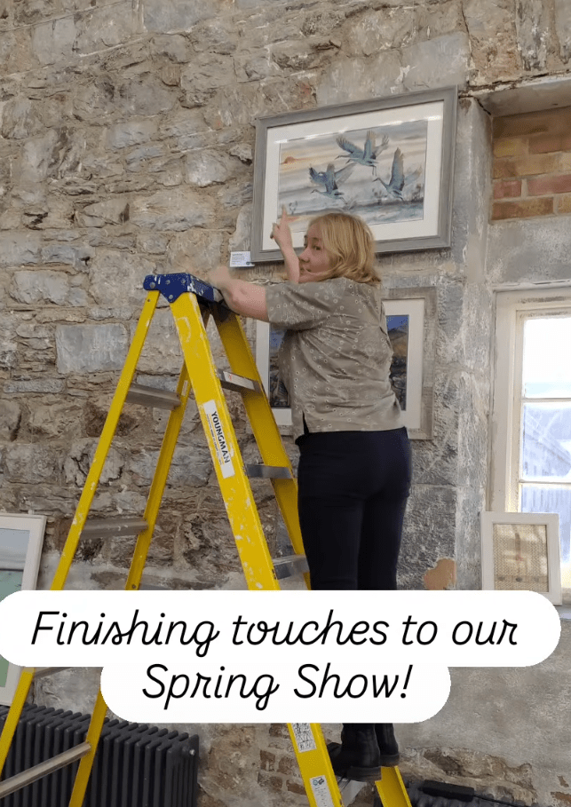
Two final neutral notes. The exhibition co-ordinator, co-ordinating with the neutral theme, while up a ladder.
The blogger/photographer fighting with sunshine, shadows and shiny surfaces.