#1248 theoldmortuary ponders

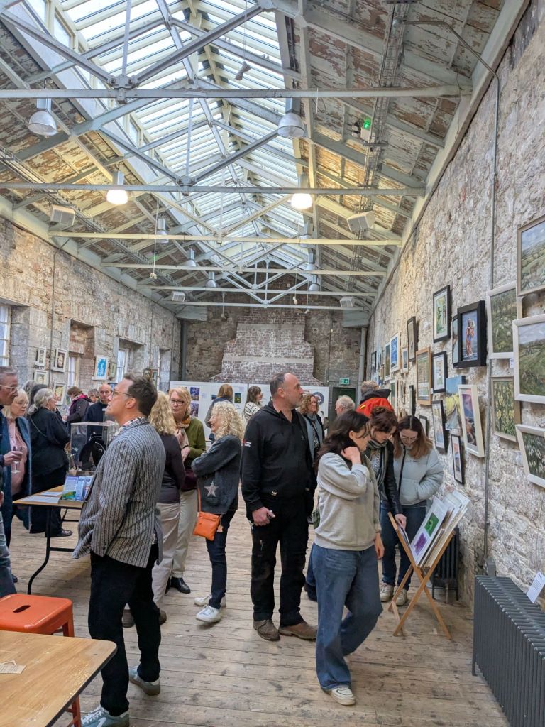
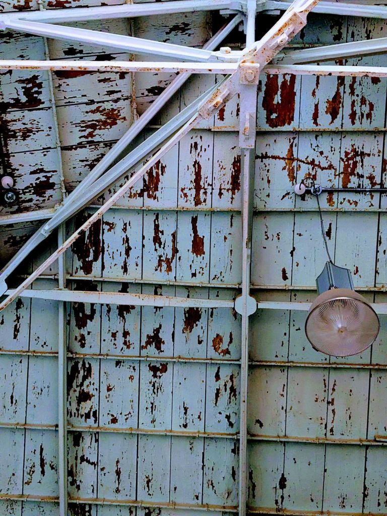
With a gallery roof that looks like this and a sunbeam catching my glass of Prosecco.

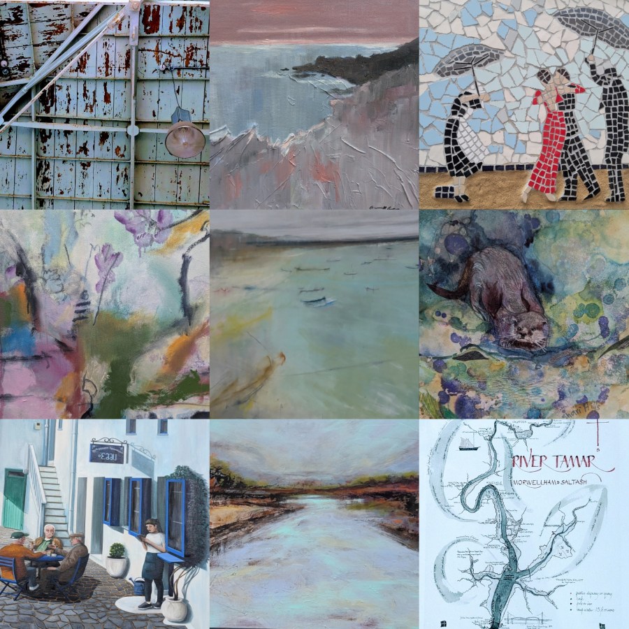
The only possible colour to chase is Aqua, hard to define. Is it blue or is it green. Does it have to have a watery element or can it feel substantial?
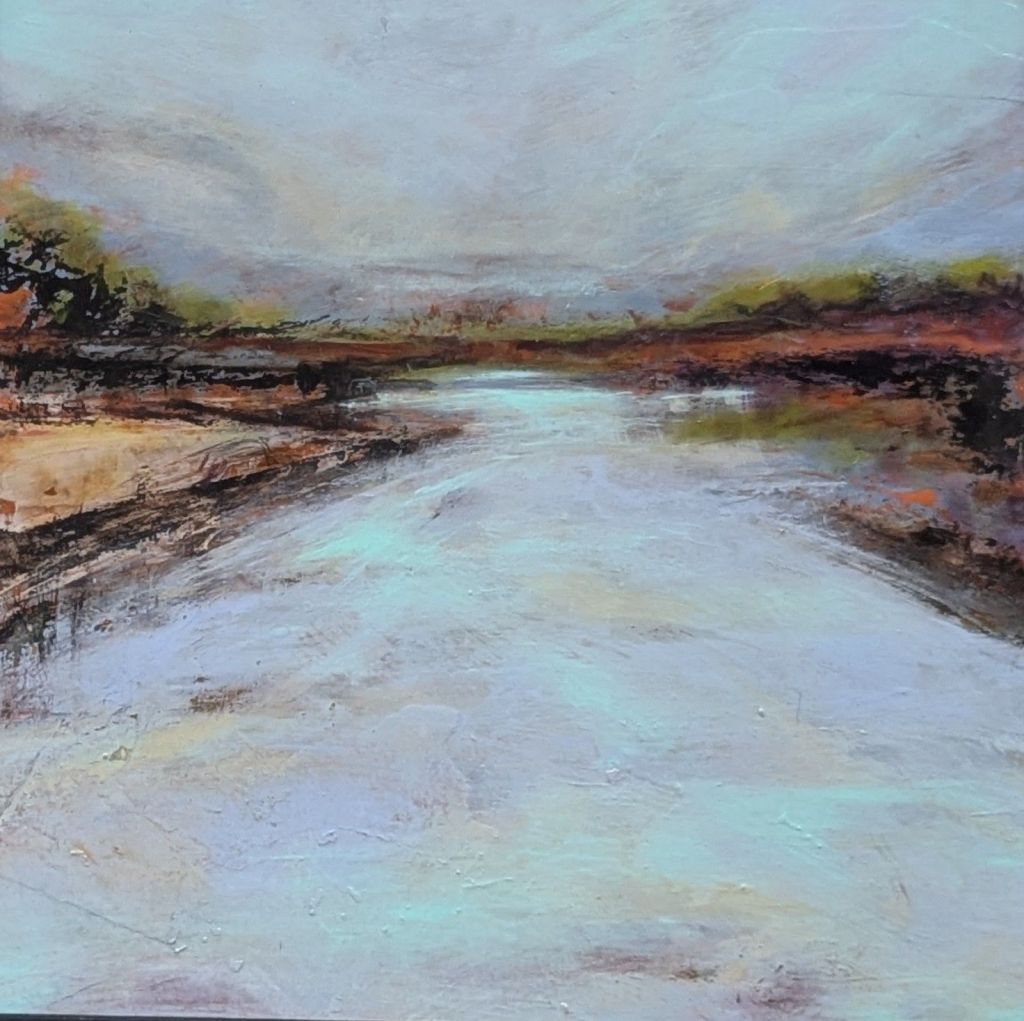
©Nuala Taylor

Estuary Blues by Nuala Taylor, links perfectly to the River Tamar and the Valley that gives our art group its name.
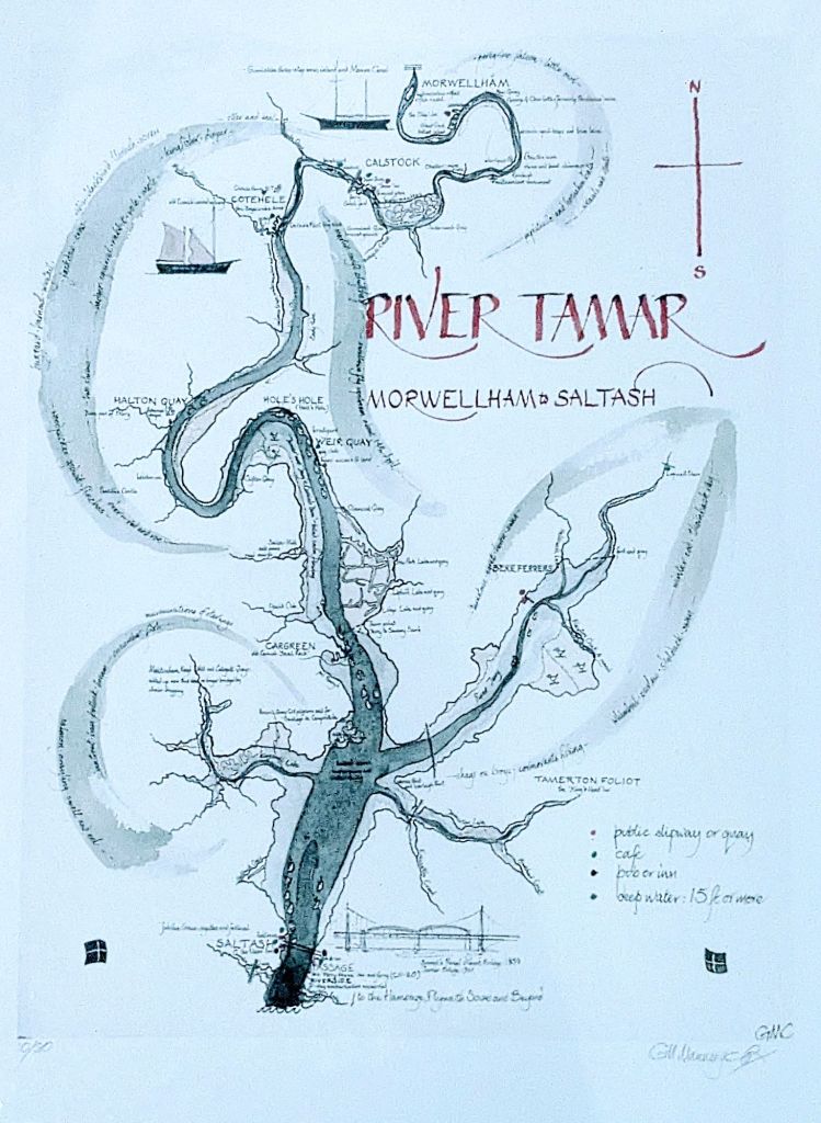
©Gill Manning-Cox

The northern reaches of the Tamar, nearer to Launceston is particularly known for having a thriving Otter population.

Otter © Shari Arnott

The abstract nature of Shari’s water eases us into the world of Jane Athron’s Abstract Number 3.
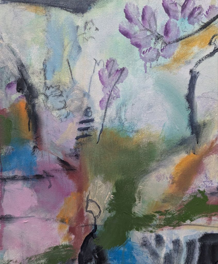
©Jane Athron

Jane’s pinks and aqua lead us colourfully to a Storm Brewing
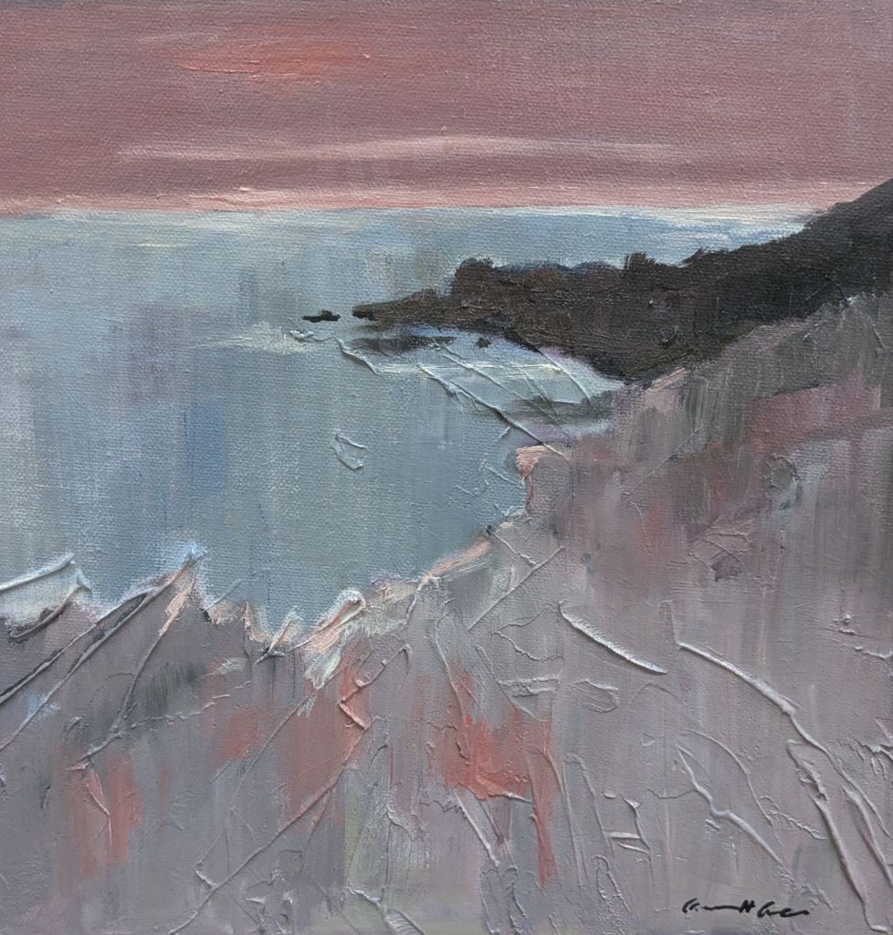
© Caroline Green

And if a storm were brewing an umbrella might be required.
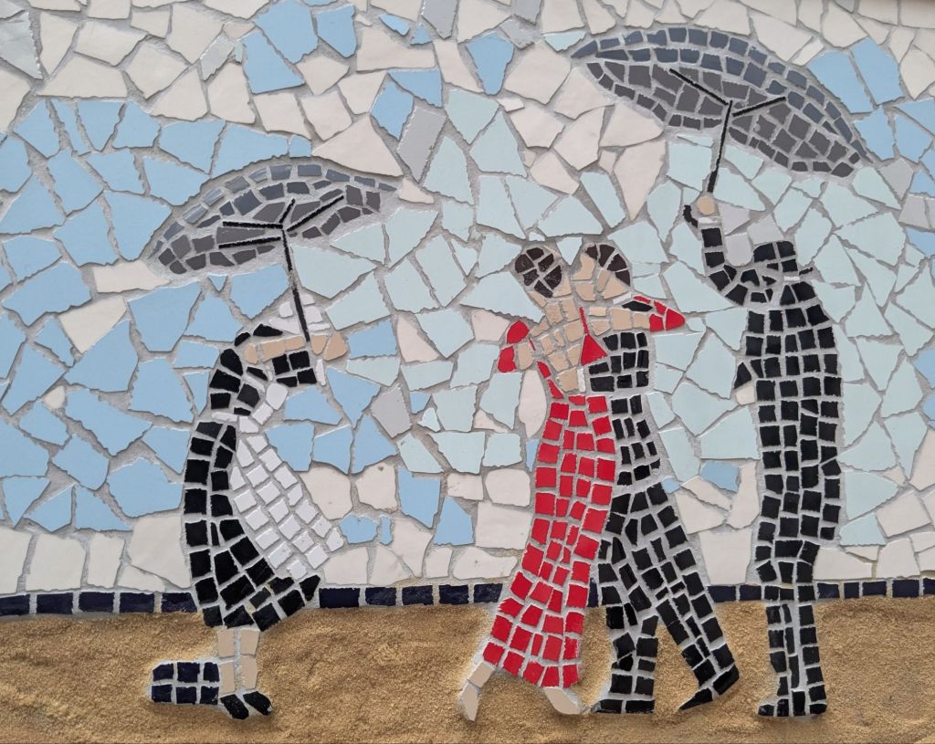
© Stuart Morrissey

Which leads us down the aqua path to somewhere with not a storm in sight.
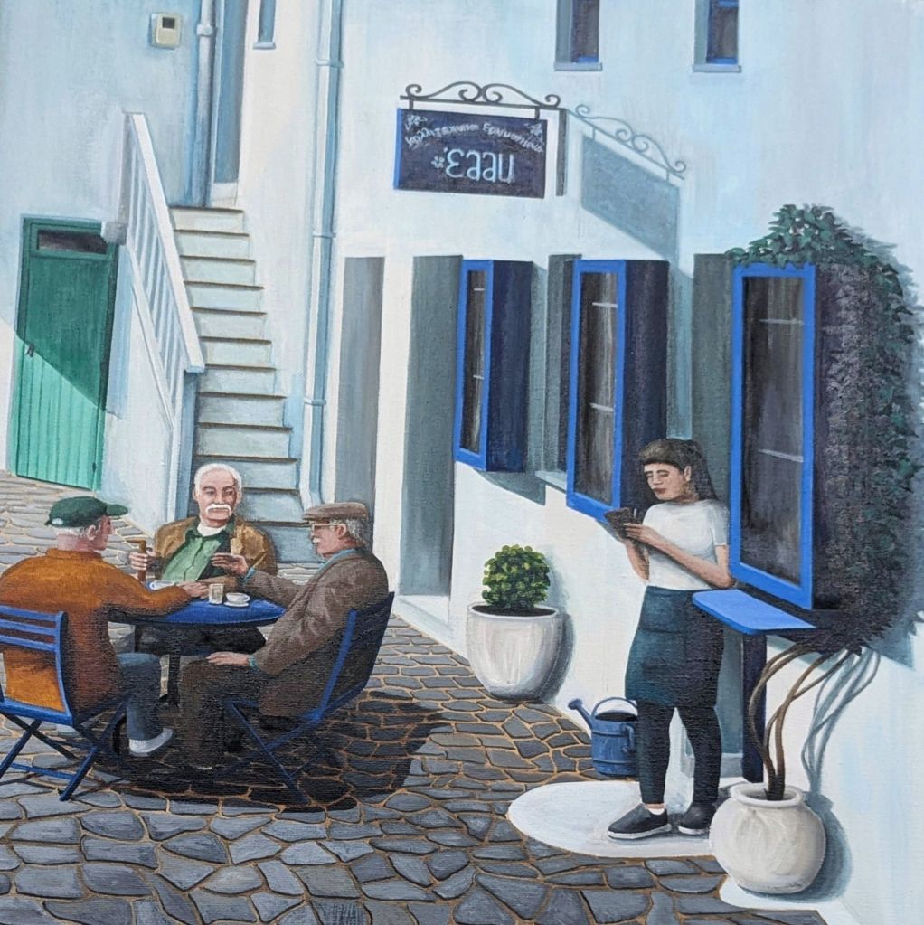
Conversation ©Tony Parr

Which is quite a way to travel from the roof of a gallery.

And a glass of fizz.

#1247 theoldmortuary ponders.

It has been a really busy 3 days setting up and running an art exhibition. Hardly time to draw breath or write a regular blog that is not exhibition centric. But today we hit the halfway point. The Private View was held last night and now we have 3 days of welcoming our guests and taking some time to enjoy the experience that has been created. I have lost count of the fabulous and fascinating conversations that I have had, but one when the hanging team were exhausted has stuck with me. Almost as a mantra for life.

We were installing art within two huge spaces in a Grade 1 listed building. The obstacles and impediments of the hang were demanding and often required improvisation.

Two artists, up high ladders were nattering as they worked.

“We are just going to have to bodge first and finesse after”

Bodge and Finesse. My new favourite word pairing.

So much of life could be described in that way. I would argue that often, to finesse is bodging and that bodge is the epitome of finesse.

Normal, less arty blogging starts next Tuesday.

#1246 theoldmortuary ponders

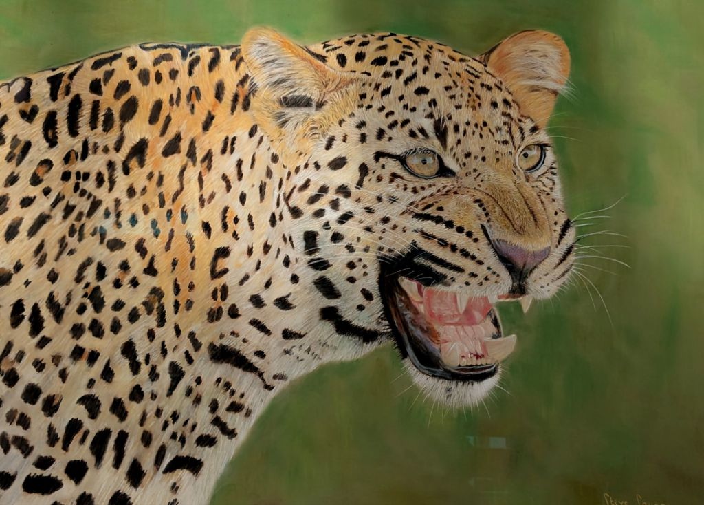
©Steve Savage

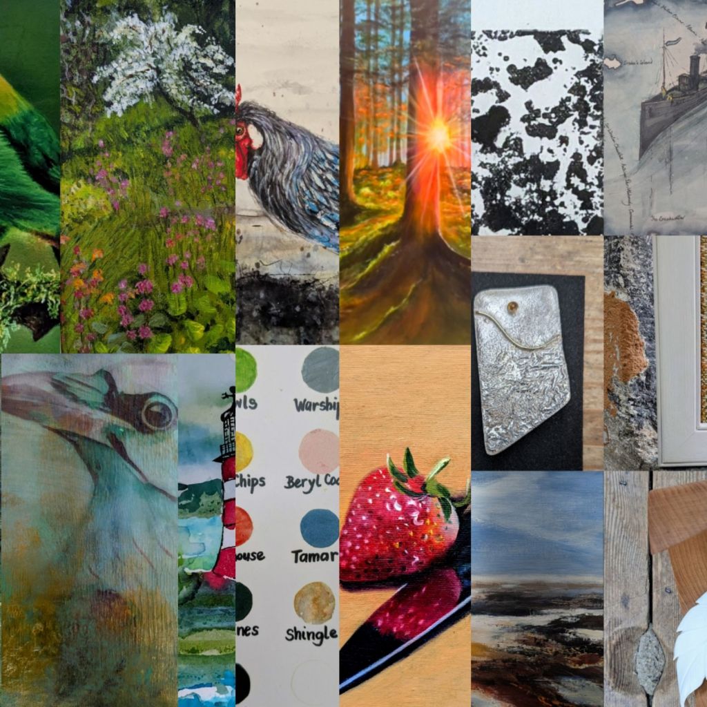
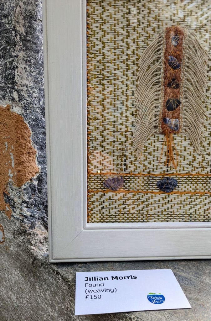
Chasing neutrals and texture, starting with a controversial one. Fashion declares that leopard print is a new neutral, so here we are with Steve Savage’s beautiful Leopard. Instinct. Below is a different type of camouflage. The perfect location for Jillian Morris’s delicate woven piece. The walls and windowsill are a perfect spot for her weave.

©Jillian Morris

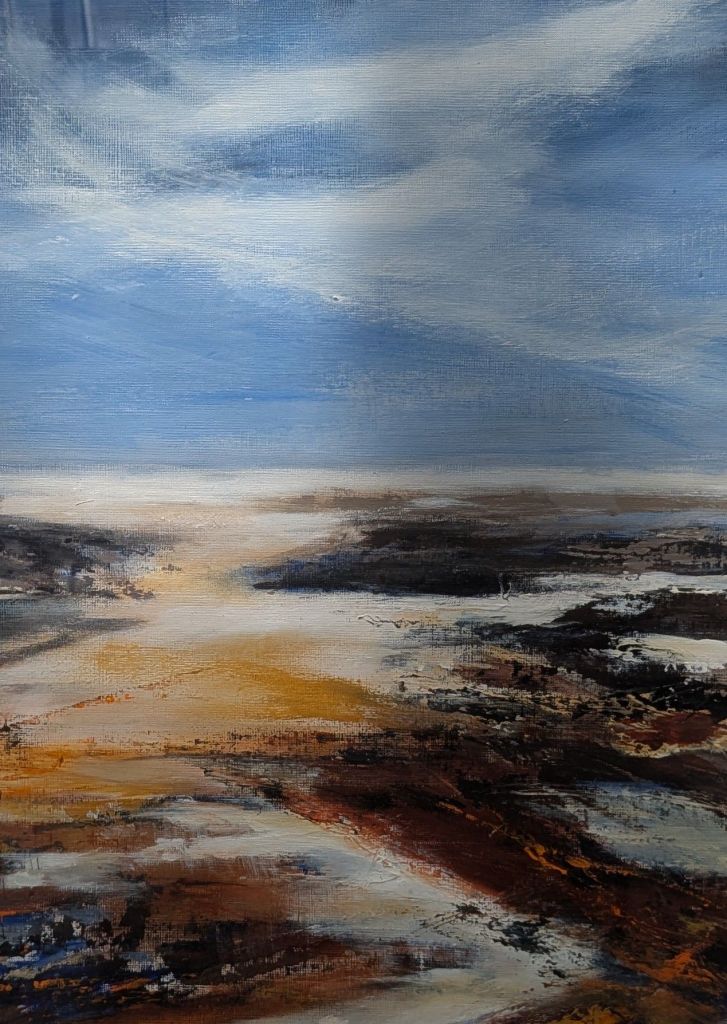
Similarly Nuala Taylor used the same neutrals for her seascape.

©Nuala Taylor

And Pippa Howes using the same neutral hues with Spring Light.

©Pippa Howes

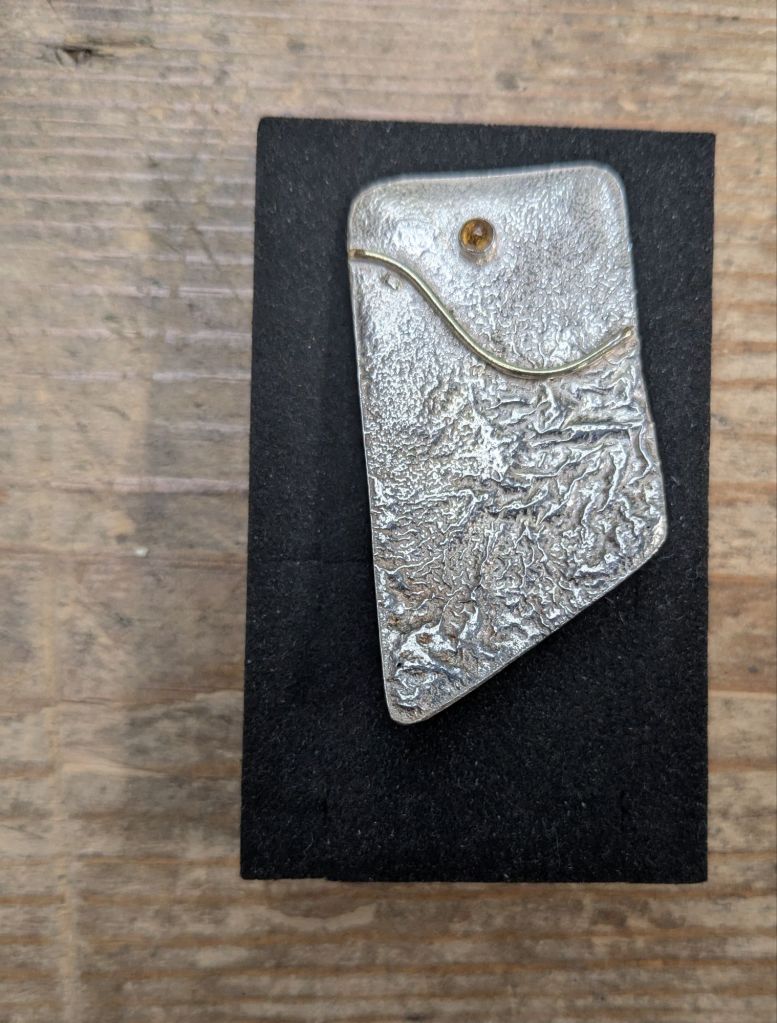
The subtle orange of Spring Light is reflected in Anne Payne’s Citrine set in Silver.

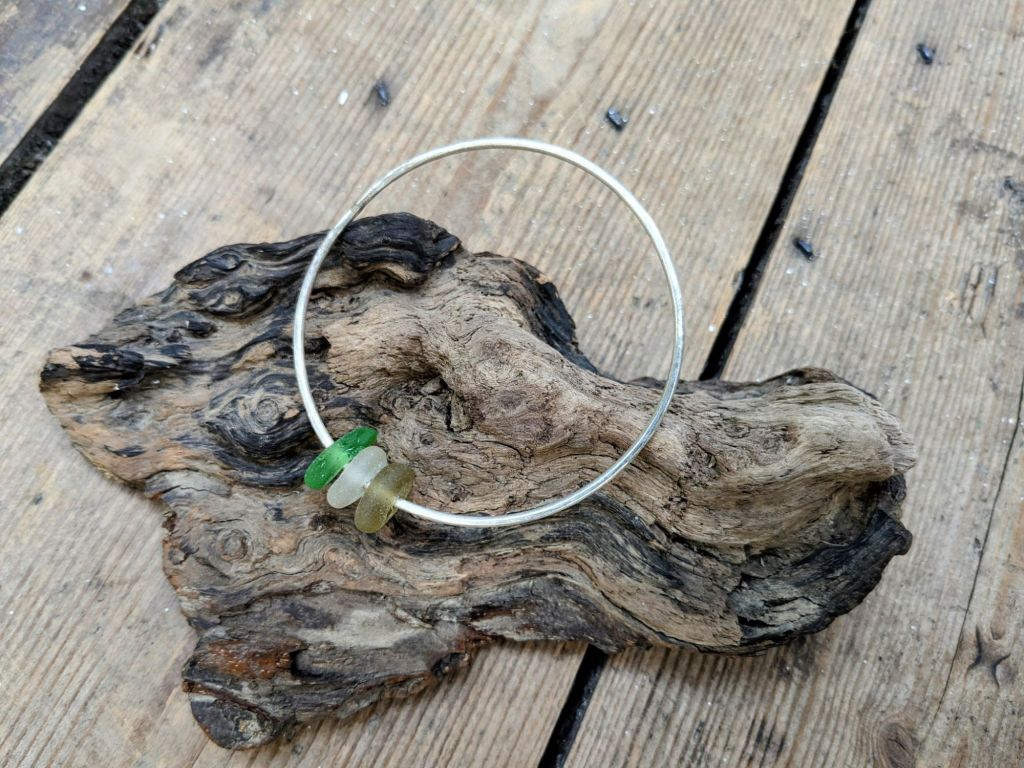
Silver merged with sea glass is the inspiration behind Kathy Lovell’s bracelet.

©Kathy Lovell

Leaping effortlessly from Silver to gold. Perfect beads of gold on Alison Freshnay’s Cradled leaf.

©Alison Freshnay

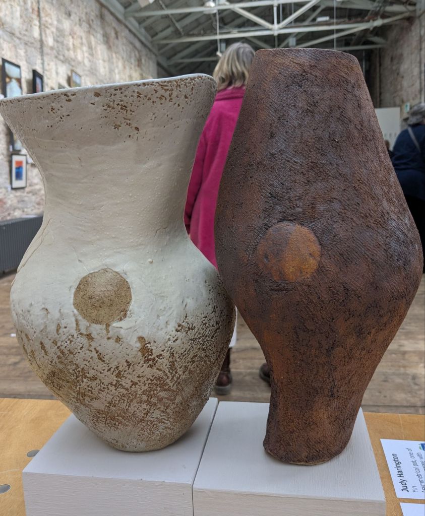
Tiny blobs of gold take us to bold ceramic blobs on Judy Haringtons tactile Yin and Yang.

©Judy Harington

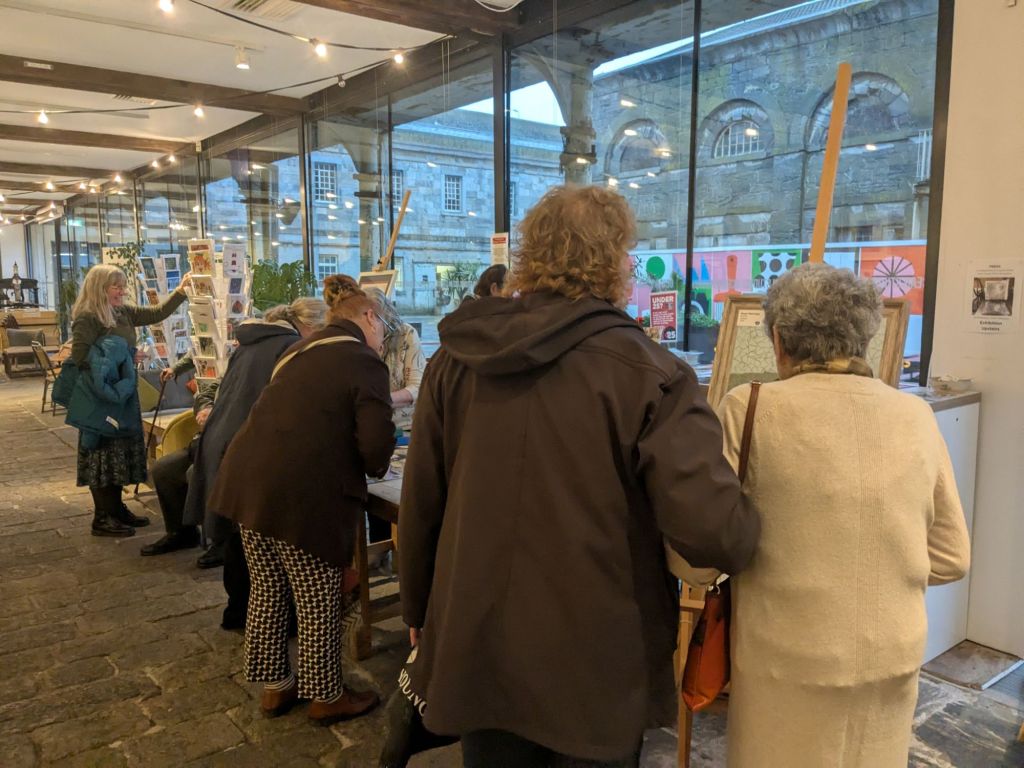
Never underestimate the value of a bold, pink coated, art lover when viewing neutrals.

Then a small black blob is the link to Celia Over’s peaceful print. Moorland Texture

© Celia Over

One last neutral. A detail from a Gill Manning Cox work. Full image later in the week.

The Plymouth Breakwater. Visible from the Royal William Yard the location of the Exhibition.

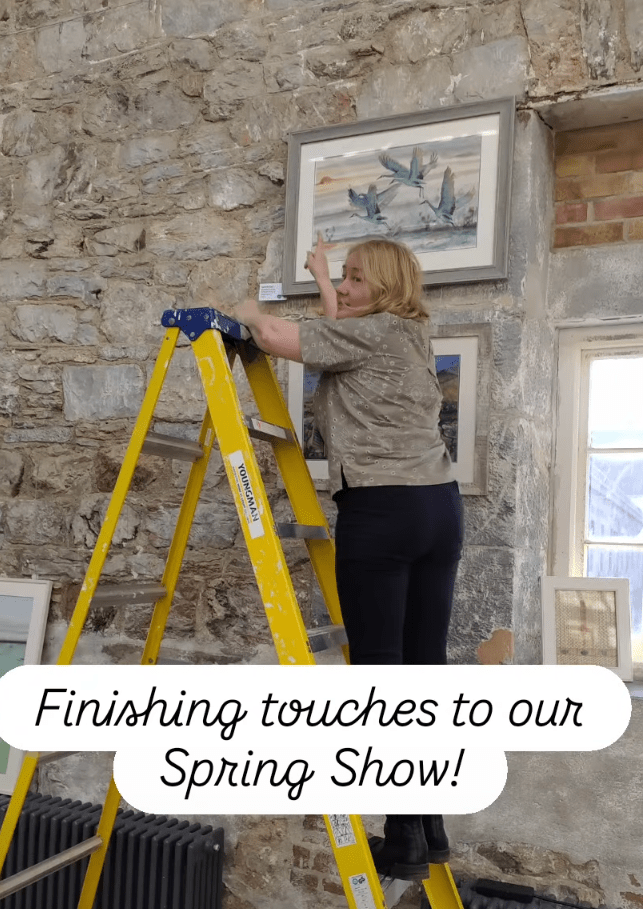
Two final neutral notes. The exhibition co-ordinator, co-ordinating with the neutral theme, while up a ladder.

The blogger/photographer fighting with sunshine, shadows and shiny surfaces.